Component Style
Writing component styles in a way that is easy to maintain over the life of a growing and changing project is a challenging task.
To solve this, we came up with the idea of style configuration or styleConfig.
This is a consistent theming API that makes component styling easy to understand
and maintain.
Base styles and Modifier styles#
Most component style consists of base or default styles and modifier styles that alter its size or visual style based on some properties or state.
Common modifier styles includes:
- Size: A component can have different sizes (e.g. small, medium, large)
- Variant: A component can have different visual styles (e.g. outline, solid, ghost)
- Color scheme: For a given variant, a component can have different color schemes (e.g. an outline button with a red color scheme)
- Color mode: A component can change its visual styles based on color mode (e.g. light or dark).
Single part and multipart components#
Most components we build today are either single part components (e.g. Button, Badge) or multipart components (e.g. Tabs, Menu, Modal).
A single part component is a component that returns a single element. For
example, the <Button> component renders a <button> HTML element:
// This component renders only one element (<button>)<Button>My button</Button>
A multipart component is a component that has multiple parts, and require these parts to work correctly. This is commonly referred to as a composite component.
For example, a Tabs component consists of TabList, Tab, TabPanels, and
TabPanel. Styling this component as a whole might require styling each
component part.
<Tabs><TabList><Tab>Tab 1</Tab><Tab>Tab 2</Tab></TabList><TabPanels><TabPanel>Tab 1</TabPanel><TabPanel>Tab 2</TabPanel></TabPanels></Tabs>
Styling single part components#
The basic API for styling a single part component is:
export default {// Styles for the base stylebaseStyle: {},// Styles for the size variationssizes: {},// Styles for the visual style variationsvariants: {},// The default `size` or `variant` valuesdefaultProps: {},}
Let's say we want to create a custom button component following the design spec below.
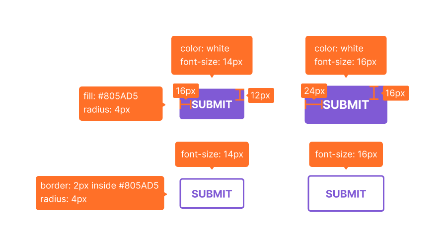
Here's a contrived implementation of the design:
const Button = {// The styles all button have in commonbaseStyle: {fontWeight: "bold",textTransform: "uppercase",borderRadius: "base", // <-- border radius is same for all variants and sizes},// Two sizes: sm and mdsizes: {sm: {fontSize: "sm",px: 4, // <-- px is short for paddingLeft and paddingRightpy: 3, // <-- py is short for paddingTop and paddingBottom},md: {fontSize: "md",px: 6, // <-- these values are tokens from the design systempy: 4, // <-- these values are tokens from the design system},},// Two variants: outline and solidvariants: {outline: {border: "2px solid",borderColor: "purple.500",color: "purple.500",},solid: {bg: "purple.500",color: "white",},},// The default size and variant valuesdefaultProps: {size: "md",variant: "outline",},}
Makes sense right? Now, let's update the theme to include this new component style.
import { extendTheme } from "@chakra-ui/react"const theme = extendTheme({components: {Button,},})
And that's it! You can use your new Button along with its custom variants throughout your app. But what if we want to create a custom component that's not part of Chakra UI? Let's use the following design spec for a Card component:

Here's a contrived implementation of the design:
const Card = {// The styles all Cards have in commonbaseStyle: {display: "flex",flexDirection: "column",background: "white",alignItems: "center",gap: 6,},// Two variants: rounded and smoothvariants: {rounded: {padding: 8,borderRadius: "xl",boxShadow: "xl",},smooth: {padding: 6,borderRadius: "base",boxShadow: "md",},},// The default variant valuedefaultProps: {variant: "smooth",},}
As with the Button component, we'll update the theme to include the new Card component style.
import { extendTheme } from "@chakra-ui/react"const theme = extendTheme({components: {Card,},})
But in this case we'd have to consume these styles because the Card
component is not a built-in component in Chakra UI.
Consuming style config#
Since the new Card component is not part of Chakra UI we need to create a
new React component and consume the style we just created. We can do that using
useStyleConfig hook.
useStyleConfig API#
const styles = useStyleConfig(themeKey, props)
Parameters#
themeKey: the key intheme.componentsthat points to the desired styleConfig.props: the options object used to compute the component styles. It typically consists of thesize,variant, andcolorScheme
Return Value#
The computed styles for the component based on props passed. If no props is
passed, the defaultProps defined in the style config will be used.
import { Box, useStyleConfig } from "@chakra-ui/react"function Card(props) {const { variant, children, ...rest } = propsconst styles = useStyleConfig("Card", { variant })// Pass the computed styles into the `__css` propreturn <Box __css={styles} {...rest} />}
Please note that we are passing the styles to the prop
__css. It has the same API as thesxprop, but has a lower style priority. This means you can override the style properties with chakra style props.
And lastly - the fun part - let's use our custom Card component anywhere in our app:
// 1. Using the default props defined in style configfunction Usage() {return (<Card><Imagesrc="https://chakra-ui.com/eric.jpg"rounded="full"w={32}h={32}boxShadow="md"/><Heading mt={6} maxW={60} size="lg" textAlign="center" color="gray.700">Welcome back, Eric</Heading><Text mt={6} mb={6} size="sm" color="blackAlpha.500">Use your fingerprint to continue.</Text><Image src="/fingerprint.png" w={32} h={32} /></Card>)}// 2. Overriding the defaultfunction Usage() {return (<Card variant="smooth"><Imagesrc="https://chakra-ui.com/eric.jpg"rounded="full"w={32}h={32}boxShadow="md"/><Heading mt={6} maxW={60} size="lg" textAlign="center" color="gray.700">Welcome back, Eric</Heading><Text mt={6} mb={6} size="sm" color="blackAlpha.500">Use your fingerprint to continue.</Text><Image src="/fingerprint.png" w={32} h={32} /></Card>)}
Styling multipart components#
This is very similar to styling single part components with a few differences you need to be aware of.
- Given that multipart refers to a component with multiple parts, you'll need to
define the parts in a
partkey in the style config. - You'll need to provide styles for each
part,baseStyle,sizes, andvariants.
Here's what the style config for multipart components looks like:
export default {// The parts of the componentparts: [],// The base styles for each partbaseStyle: {},// The size styles for each partsizes: {},// The variant styles for each partvariants: {},// The default `size` or `variant` valuesdefaultProps: {},}
For example, here's what the style configurations for a custom menu component looks like:
const Menu = {parts: ["menu", "item"],baseStyle: {menu: {boxShadow: "lg",rounded: "lg",flexDirection: "column",py: "2",},item: {fontWeight: "medium",lineHeight: "normal",color: "gray.600",},},sizes: {sm: {item: {fontSize: "0.75rem",px: 2,py: 1,},},md: {item: {fontSize: "0.875rem",px: 3,py: 2,},},},defaultProps: {size: "md",},}
Next, we'll update the theme object to included this new component style.
import { extendTheme } from "@chakra-ui/react"const theme = extendTheme({components: {Menu,},})
Consuming multipart style config#
Now that the style config is hooked into the theme, we can consume within any
component using useMultiStyleConfig hook.
We can also mount the computed styles on a specialized context provider called
StylesProvider. These styles will now be available to other sub-components. To
read from the context, use the useStyles hook.
useMultiStyleConfig API#
const styles = useMultiStyleConfig(themeKey, props)
Parameters#
themeKey: the key intheme.componentsthat points to the desired styleConfig.props: an option of the options for computing the final styles. It typically consists of thesize,variant, andcolorScheme.
Return Values#
The computed styles for each component part based on size, or variant. If
none of these were passed, the defaultProps defined in the styleConfig will be
used.
// 1. Import the components and hookimport {StylesProvider,useMultiStyleConfig,useStyles,} from "@chakra-ui/react"function Menu(props) {const { size, variant, children, ...rest } = props// 2. Consume the `useMultiStyleConfig` hookconst styles = useMultiStyleConfig("Menu", { size, variant })return (<Flex __css={styles.menu} {...rest}>{/* 3. Mount the computed styles on `StylesProvider` */}<StylesProvider value={styles}>{children}</StylesProvider></Flex>)}function MenuItem(props) {// 4. Read computed `item` styles from styles providerconst styles = useStyles()return <Box as="button" __css={styles.item} {...props} />}
That's it! We can use our newly created multipart component in our application:
// 1. Using the default props defined in style configfunction Usage() {return (<Menu><MenuItem>Awesome</MenuItem><MenuItem>Sauce</MenuItem></Menu>)}// 2. Overriding the defaultfunction Usage() {return (<Menu size="sm"><MenuItem>Awesome</MenuItem><MenuItem>Sauce</MenuItem></Menu>)}